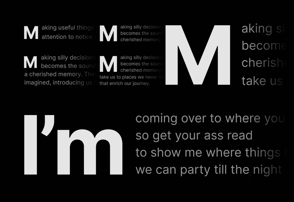
I wanted a drop cap for Whale. Not just a decorative capital pasted onto the first paragraph. Something responsive to the paragraph, the typeface, the screen size, and the personality of each letter (within the roman alphabet). This is a little overview of how I got it to work.
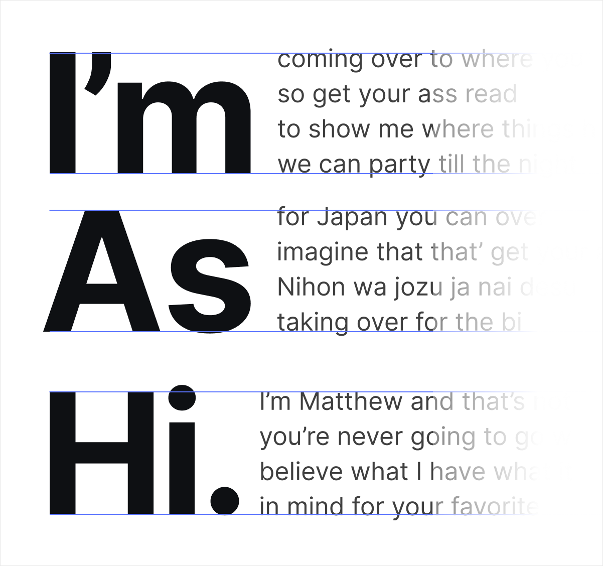
This setup handles two, three, and four lines. Instead of being a single letter all the time, it can work with 2-3 letter words such as As; punctuation such as Hi.; contractions such as I’m; linked openings; different typefaces; and the unruly Q and its tail.
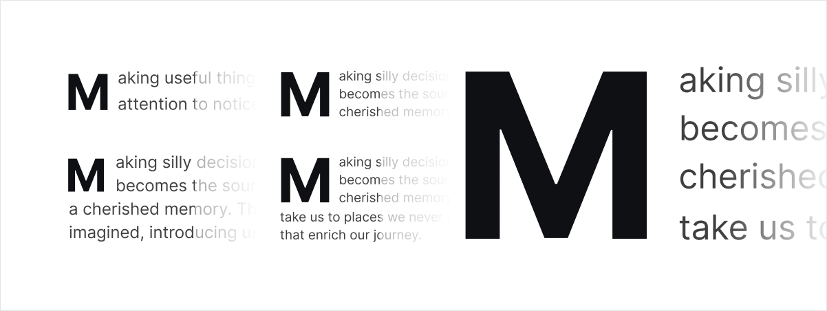
The blue lines below are diagnostic guides, not part of the live treatment. The top line follows the visible top of a lowercase x on the first body line. The bottom line follows the visible bottom of the x on the last line beside the cap.
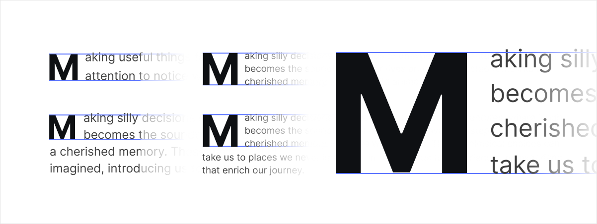
One system, many openings.
Fonts are full of noncompliant parts. An I is narrow. A and W arrive with luggage. An M is angles pretending to be a rectangle. Lots of probs to solve.
The Q is an O with an escape slide. It needs an explicit optical rule. Its circular bowl aligns with the lower guide; the tail may continue beneath it. Measuring the lowest pixel would make the entire bowl too small. Literal consistency would produce visual inconsistency.
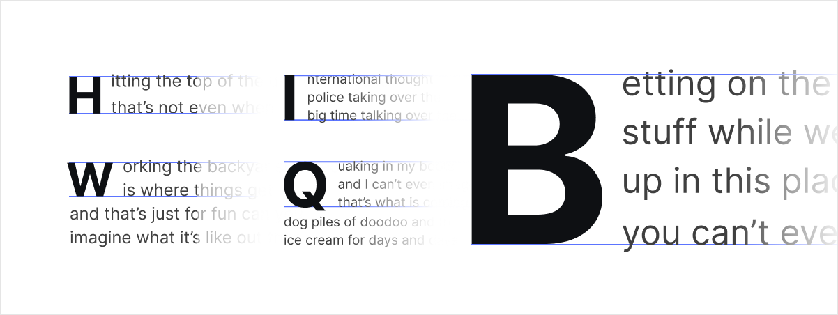
Caps aren't just for breakfast anymore.
Drop caps tend to be just first letters, but I didn't like that setup. I gave drop caps some range for when they want to play together. If a post opens with a short word like As, the whole word becomes the cap instead of a lonely A with the s dangling after it. Same for Hi. and I’m. Short words get to stay together.
Play nice with links please.
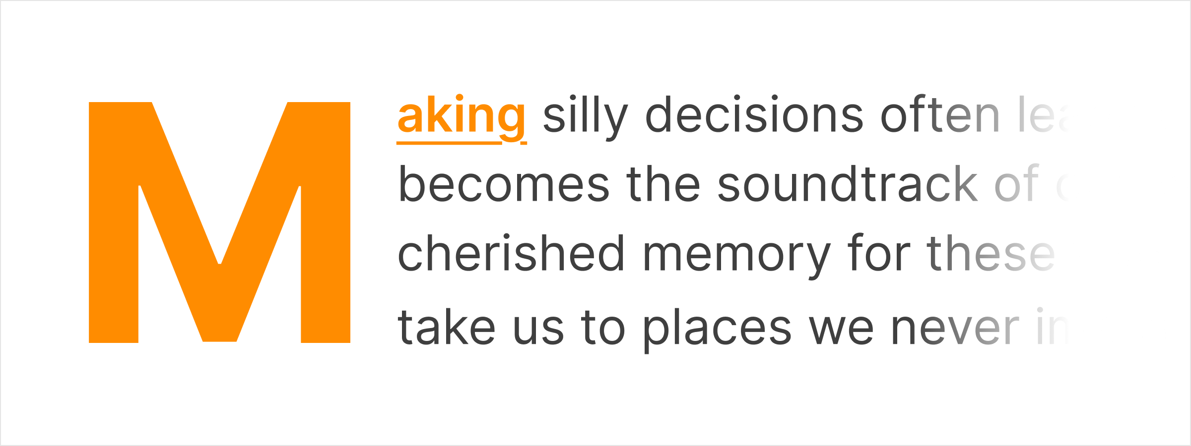
If I have a link, I need to be able to split the opening into separate pieces. The cap (colored), and the text with an underline. The large initial keeps the link color but loses the gigantic underline. The remainder stays a normal link style.
An aside about using AI.
AI made this possible at a speed I would not have attempted alone. Good job robot. It explored Canvas, SVG, DOM ranges, masks, font metrics, resize behavior, and a mildly unreasonable matrix of letters and viewports. It allowed me to try a spread of approaches and review them all.
It was also annoying as fuck and repeatedly told me the broken version was correct. I almost lost my eyeballs in the back of my head I rolled them so hard.
The breakthrough was not a better instruction to “be more careful.” It was changing the observation system. I added an instruction for independent blue guides, modeled first from Figma. We captured individual examples at actual size. We treated visible disagreement as failure even when every number was green. I keep noticing that AI works best when we can agree that we're experiencing something in as similar a way as possible. I lose confidence when it seems to see something from a wildly different (and for me, wrong) vantage.
That changed the collaboration. I supplied the visual judgment and the rules. AI turned those rules into measurements, stress cases, and rapid iterations. Boomski.
Take the machinery with you.
The download includes the measured drop-cap engine, its CSS and alternate Inter I, a working example, design rules, browser support, troubleshooting, and the licenses. It is a reference implementation rather than a paste-it-anywhere miracle. Browsers remain browsers.
Notes.
1. Adobe tried this in 2015. dropcap.js reads font metrics to size one letter to a line count. Single glyph, fixed pixels. Florian Brinkmann later made it responsive.
2. Browsers now have a built-in version, CSS initial-letter. It aligns cap height to the first line and baseline to the last. One letter only, no optical rule for Q, and no Firefox.
3. The CSS Working Group has an open proposal, issue 5220, to align drop caps by the measured ink of the actual glyph instead of font-wide metrics. Still a proposal.
4. drop-cap by Tadeusz Rychter goes the other way and wraps body text around the letter's outline.
5. Type designers argue about where a drop cap should sit in this TypeDrawers thread. Baseline wins, mostly because InDesign does it that way.













Have somethin' to say?
Subscribe to whale.fyi to comment, and get updates by email. It keeps comments smart and kind, and keeps trolls in their musty caves where they belong. Plus you get an email with each post. Wow, so handy!
Already subscribed?
Sign InWanna subscribe?
Sign Up